 |
|
Selected works. |
|
 |
SIMIAN.INTERFACE |
website | vested interest games An abstract spatial reasoning puzzle game designed to be very accessible but deep nonetheless. I handled all of the code and split the art and design duties. Lo-bit music by NOTE! |
|
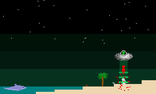 |
OVNI |
|
A Flash/Flixel game I developed with a friend as an experiment in improv design, crowdsourcing, community content, and Flash distribution. I handled all of the code and split the art and design duties. Lo-bit music by NOTE! |
|
 |
CODA |
|
A top-down musical collection game designed to exhibit emergent gameplay. A casual marriage of Electroplankton and flOw with an editor. |
|
Team
Size: 4 |
|
Development
Time: 2 Weeks (Rapid Prototype) |
|
My
Role: Design, Management, Art and Sound |
|
© jonathan yuhas 2015 | jonathanyuhas@gmail.com